New iMacs were released recently (13th Oct, 2015). The iMac is now a compelling machine in both 21.5-inch and 27-inch formats. The upgrade includes a new panel that has an extended color gamut.
Producing and Comparing Gamuts
Normal white LED backlights produce a lot of blue light, but not as much red or green light. Late 2015 iMacs are using the not-that-new GB-r LED backlight technology. This creates a much stronger green and red spectral component to match the already strong blue. The larger gamut can reproduce more vivid greens, reds, and their derivatives (cyan, yellow, magenta). These panels can target larger colorspaces, the most common being Adobe RGB in professional displays. In recent memory Apple has never shipped a wide gamut display, I am happy to see that has changed. Hopefully the larger gamut will find its way to all Apple products eventually.
Apple decided to go with DCI-P3 instead of Adobe RGB for their wide gamut colorspace. This is an interesting decision, lets try to understand the differences. When we take a 2D chromaticity diagram of both and compare them we get figure 1 . Apple's target P3 colorspace can cover fewer teals and greens (light shaded area). However, P3 is stronger in yellow-green, yellow, orange, red, and magenta (dark shaded area). If instead we compare P3 to the standard sRGB colorspace, the differences are even more significant ( figure 2 ).
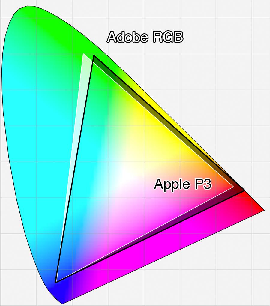
Figure 1
Adobe RGB in white compared to Apple P3 in black.
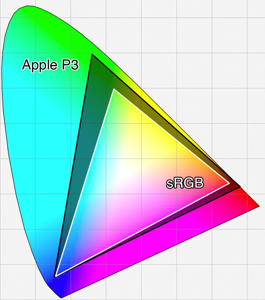
Figure 2
sRGB in white compared to Apple P3 in black.
Real World Comparison — The Teal Lake
I selected a series of test images to analyze the difference in real usage. Using soft proofing in Lightroom against a DCI-P3 target, images were selected which exceed sRGB but which P3 could reproduce. A pair of files was exported for each image, one in ProPhoto RGB, and the other converted to sRGB. Then I visited an Apple Store and annoyed the staff (sorry!). I did bring my calibration tool with software, but they did not let me use it to profile the display. It is very difficult to photograph a screen and have the subtle color differences show up. Most of my illustration here will be generated overlays.
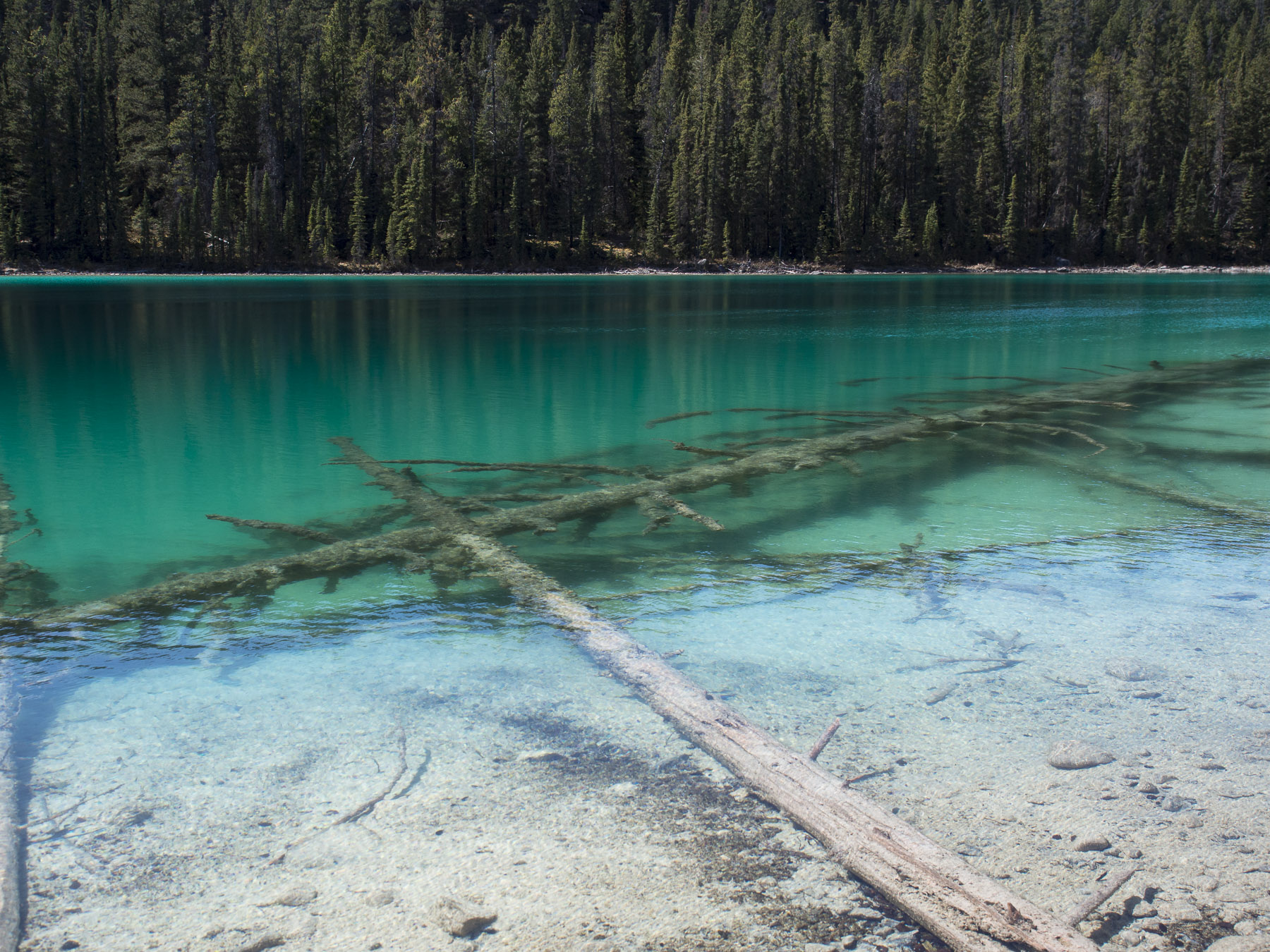
Figure 3
First Lake in Valley of Five Lakes, Canada. Image is in Adobe RGB colorspace.
First off is this lovely photo of a lake in Canada. The teals in this photo represent a case where Adobe RGB surpasses P3, and both colorspaces are markedly larger than sRGB. The composite overlay ( figure 4 ) indicates which areas of the image are not reproducible by which colorspaces. Red is not reproducible by sRGB, blue not reproducible by sRGB or Apple P3, and green is not reproducible by sRGB, Apple P3, or Adobe RGB. Each colorspace in turn has better coverage of teal hues, and therefore can reproduce more of the image.
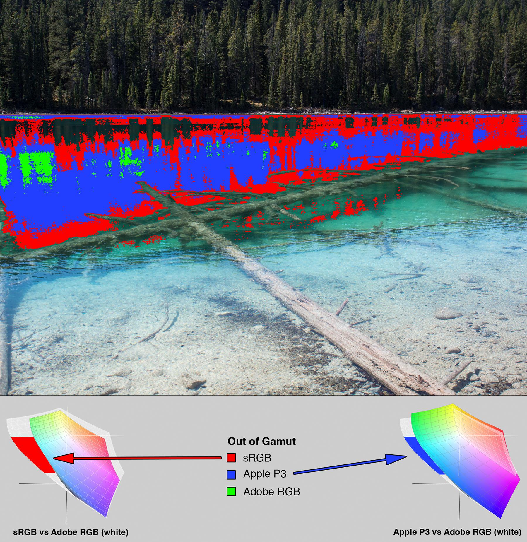
Figure 4
The red overlay correlates to sRGB. At the bottom left is a 3D plot representing sRGB in color and Adobe RGB in white. The red shaded area indicates the colorspace coverage sRGB is missing to display these teal colors. The overlays on the main image and on the 3D plots relate to roughly the same colors, just a different visual representation. 3D LAB profiles will be discussed briefly later.
Real World Comparison — The Orange Car
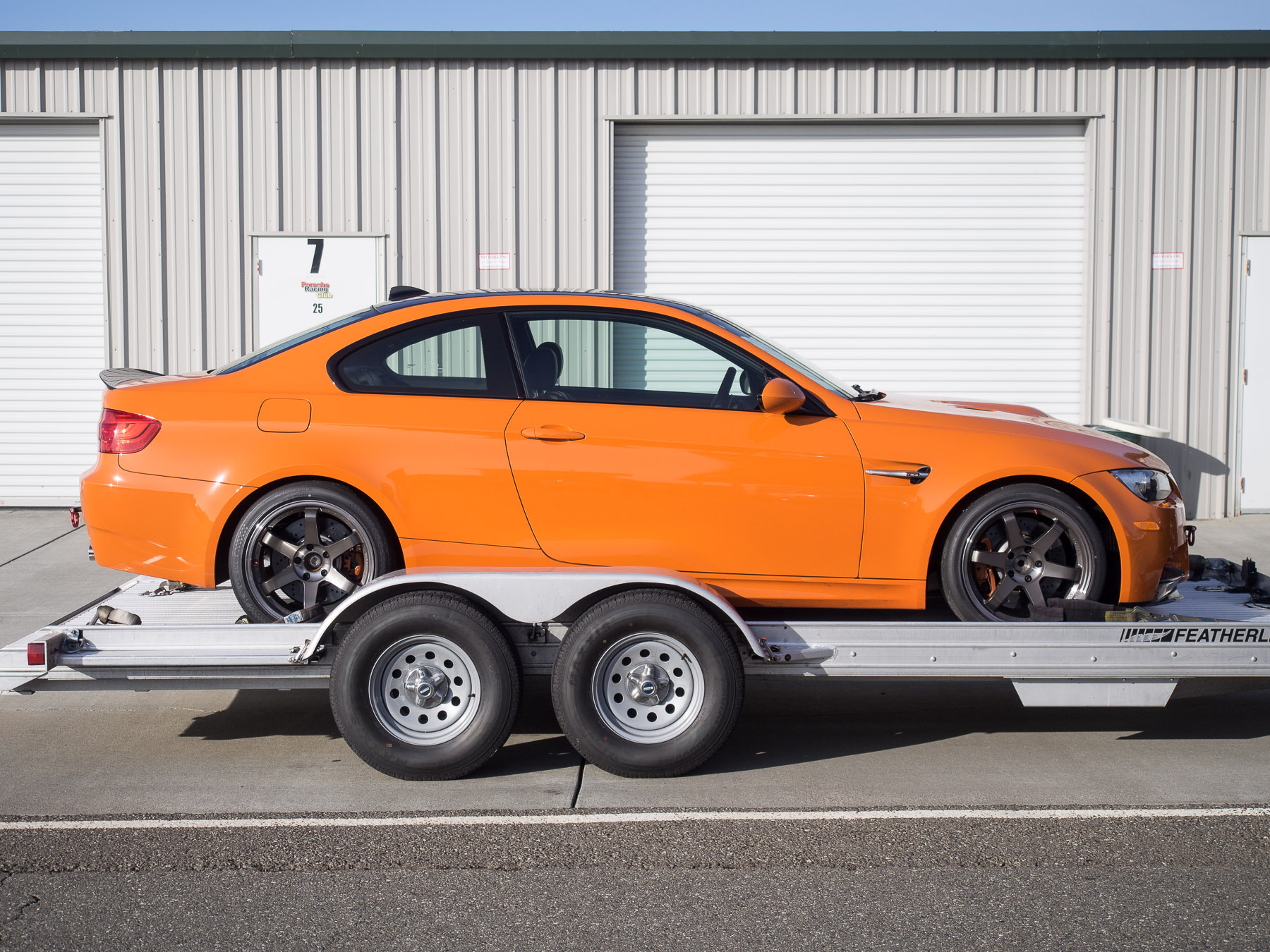
Figure 5
E92 BMW M3, modified to be almost the same as the rare M3 GTS. California. Image is in Apple P3 colorspace.
I like orange cars, so does the P3 colorspace. Orange is one of the areas where P3 exceeds both Adobe RGB and sRGB. In this composite overlay ( figure 6 ) sRGB cannot reproduce any of the orange paint whereas P3 can get pretty much all of it. Note that if you are viewing this page on an extended gamut display figure 3, 5, and 12 have been reproduced in extended colorspace. You can download and view these if your browser does not support extended colorspaces.
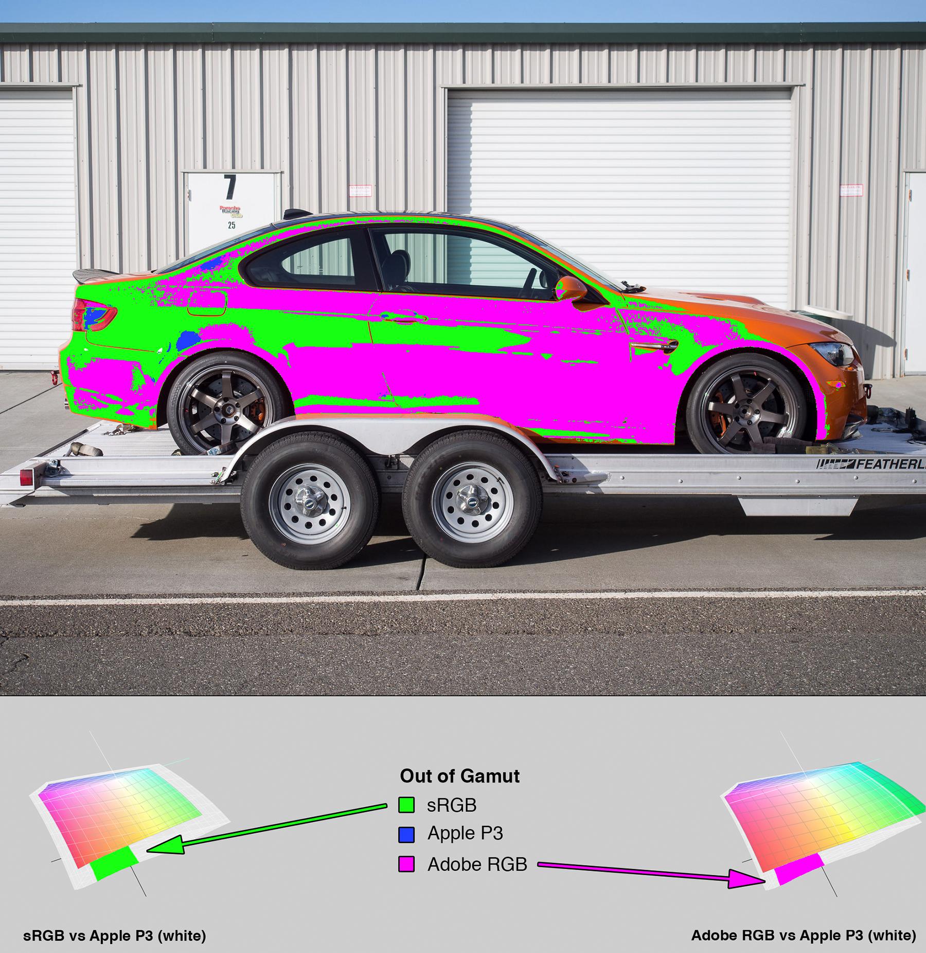
Figure 6
The colors change with each image to keep them visible. I can't use red here because it blends in too much with the orange. The representation is the same.
In the 3D plots it is clear that the gamut required to display the bright, rich orange is only available in the P3 colorspace. On the 27-inch iMac in person this photo had a lot of punch. The orange was bright, saturated, and brilliant to look at ( figure 7 ).
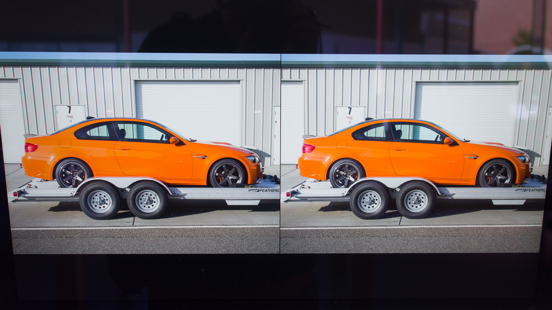
Figure 7
Doing analysis at the Apple Store. The left side is sRGB and the right side car is ProPhoto, but the camera isn't good enough to represent the difference viewed like this.
Methods of Comparing Gamuts
When you chart sRGB against Adobe RGB on a 2D chromaticity diagram ( figure 8 ), the handling of orange looks almost identical. Why does Adobe RGB do significantly better than sRGB when reproducing the orange car? While the 2D diagram is a useful way of comparing gamuts, it is not the only way, and perhaps not the best way either. Enter the 3D plot view, where the visualization takes into account not only color but luminance as well. We can see in figure 9, 10 that Adobe RGB supports better bright oranges, reds, and magentas than sRGB. It also has an advantage in bright yellows, yellow greens, and dark greens. All this in addition to its very clearly stronger bright teal and green. Adobe RGB is an even larger improvement over sRGB than it initially seems.
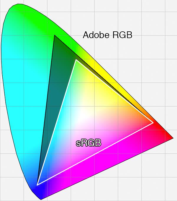
Figure 8
Comparing sRGB in white and Adobe RGB in black. Blue and red extremes are visually identical here.
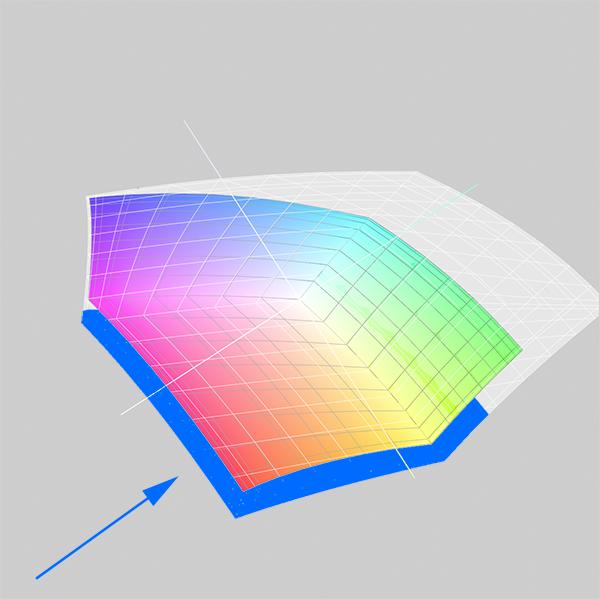
Figure 9
Comparing sRGB in color and Adobe RGB in white. Blue shaded area shows how Adobe RGB exceeds sRGB in the bright reds, oranges, magentas, and yellows. The 3D LAB plot has perspective so this difference is exaggerated.
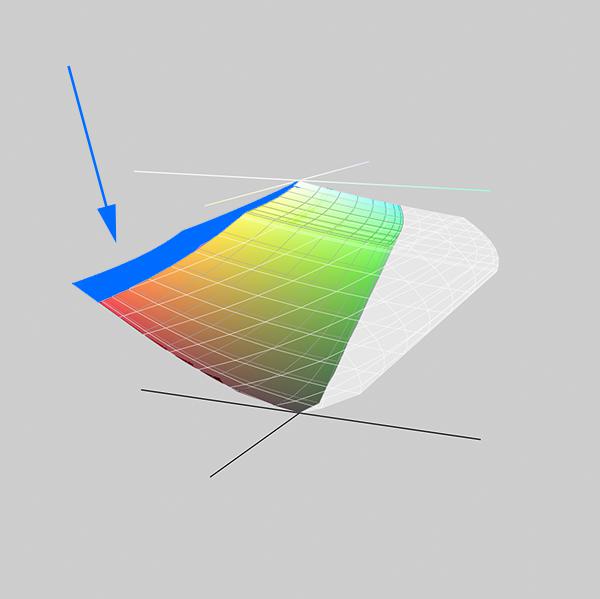
Figure 10
Comparing sRGB in color and Adobe RGB in white. On the right side unshaded notice the huge volume of greens available to Adobe RGB.
If you run OS X you can view these 3D profiles easily. In /Applications/Utilities there is an application called ColorSync Utility. It allows you to select profiles from the left pane and view them ( figure 11 ). I have captured a video of tumbling around an sRGB vs Adobe RGB comparison in ColorSync Utility. It is available here (MP4, 2.4 MB): Video
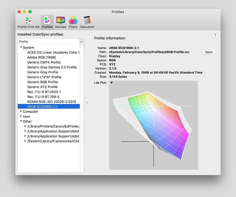
Figure 11
ColorSync Utility is a very useful program, and built in to OS X.
Real World Comparison — The Green Bird
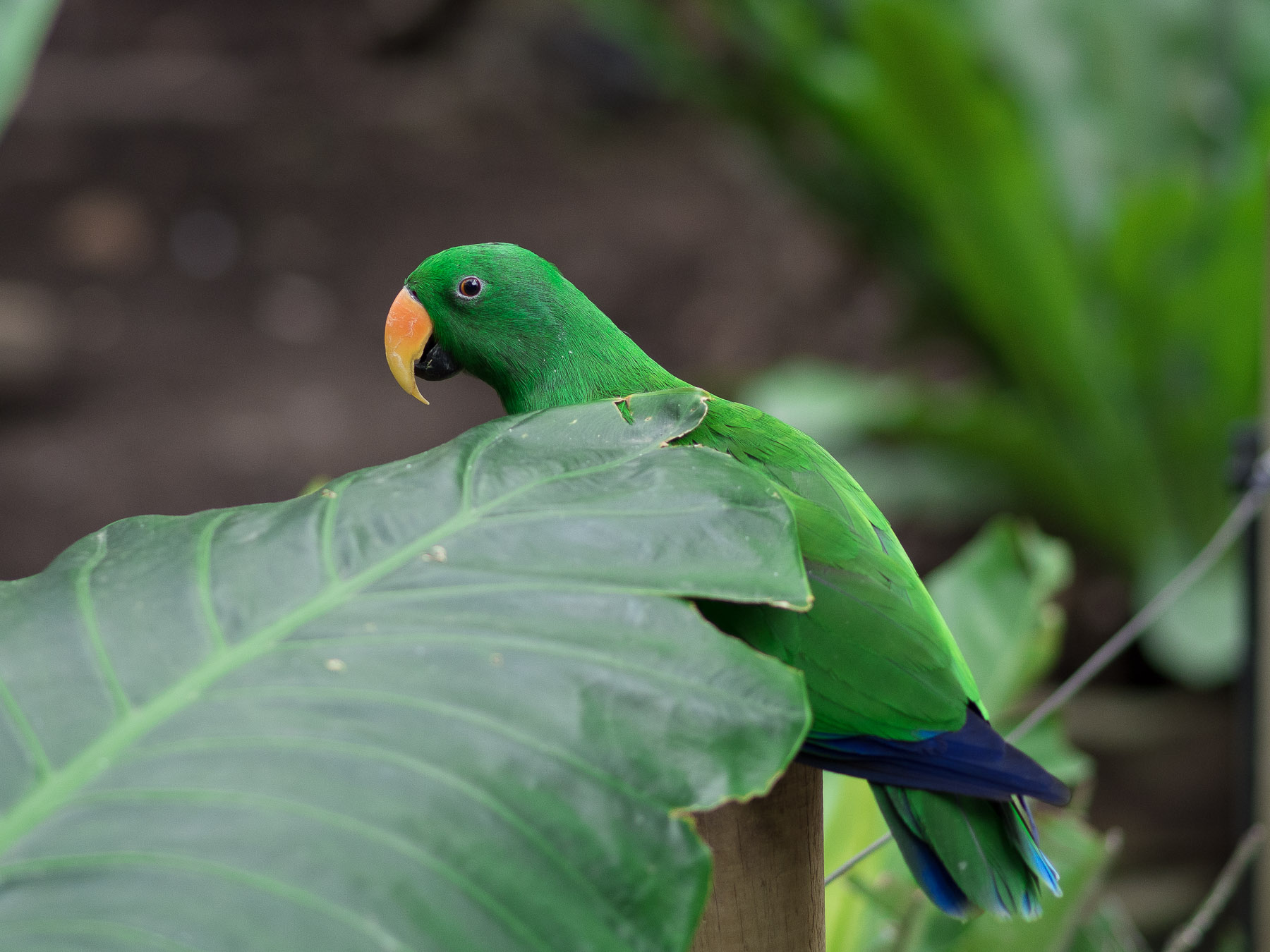
Figure 12
A male Eclectus parrot. They have a high degree of sexual dimorphism. Male is green, female is red. Australia. Image is in Apple P3 colorspace.
This is an interesting situation because P3 and Adobe RGB excel at different shades of green in the same photograph. Apple P3 does a good job rendering the yellow greens of the background plant. However, it can not represent the more pure and darker greens on the parrot. Adobe RGB has the opposite problem, doing a great job on the parrot but missing somewhat on the plant. sRGB is of course outclassed by both.
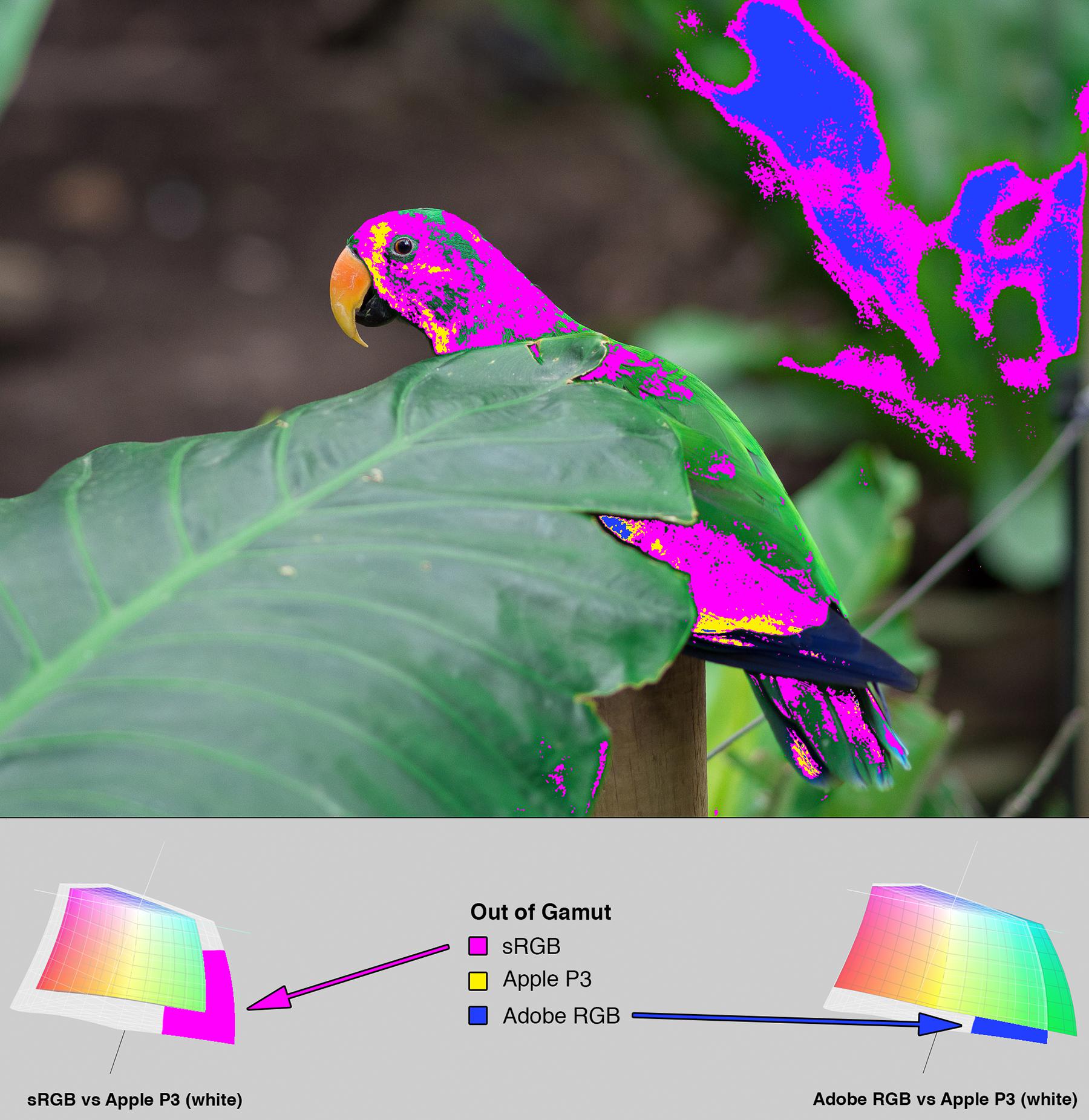
Figure 13
sRGB is still a very capable colorspace. Many of the greens in this photo are within sRGB despite its significantly smaller gamut.
How I Learned to Stop Worrying and Love Wide Gamut
Extended gamut displays can help you enjoy richer photos. Prepare photos for print, or during the processing stages of any imaging pipeline. It could be useful to color grade video which is destined for digital cinema. I'm not sure how many people are doing that on iMacs, but perhaps you could now. What Apple ships with the iMac is an exceptional display by any standard.
The difference between sRGB and Apple P3 is noticeable, but not immense. I had to pick and choose carefully to find images which accentuate the differences. Most of my photos show no advantage or only minor advantage for extended colorspaces. People probably won't notice a dramatic change and a majority of images will still be in sRGB. While the iPhone 6S shoots sRGB JPEGs, expect future phones to do better. Apple will almost certainly follow the iMacs and 9.7-inch iPad Pro with more wide gamut devices.
OS X, and iOS too as of 9.3, offers fairly robust handling of color profiles. It gets most things right most of the time, and most content is color managed by default. A notable exception is OpenGL views. The most important thing to remember is that sRGB is the worldwide interchange colorspace. If you're going to send images to somebody check if they are sRGB — if they are not, convert them. Preview can tell you what profile is assigned and ColorSync Utility can convert. This is a great resource to understand Apple's ColorSync implementation.
We can only speculate why Apple decided to pick P3 as their wide gamut target. My personal theory is that it is a balanced enhancement of sRGB ( figure 14 ). All hues except blue receive a similar and notable extension. It was probably not done specifically to please professional printers or video colorists. As this feature continues to propagate, a lot of people will get to enjoy more brilliant images. That seems to be why Apple makes these improvements that are not strictly necessary. Democratization of technologies that improve the user experience.
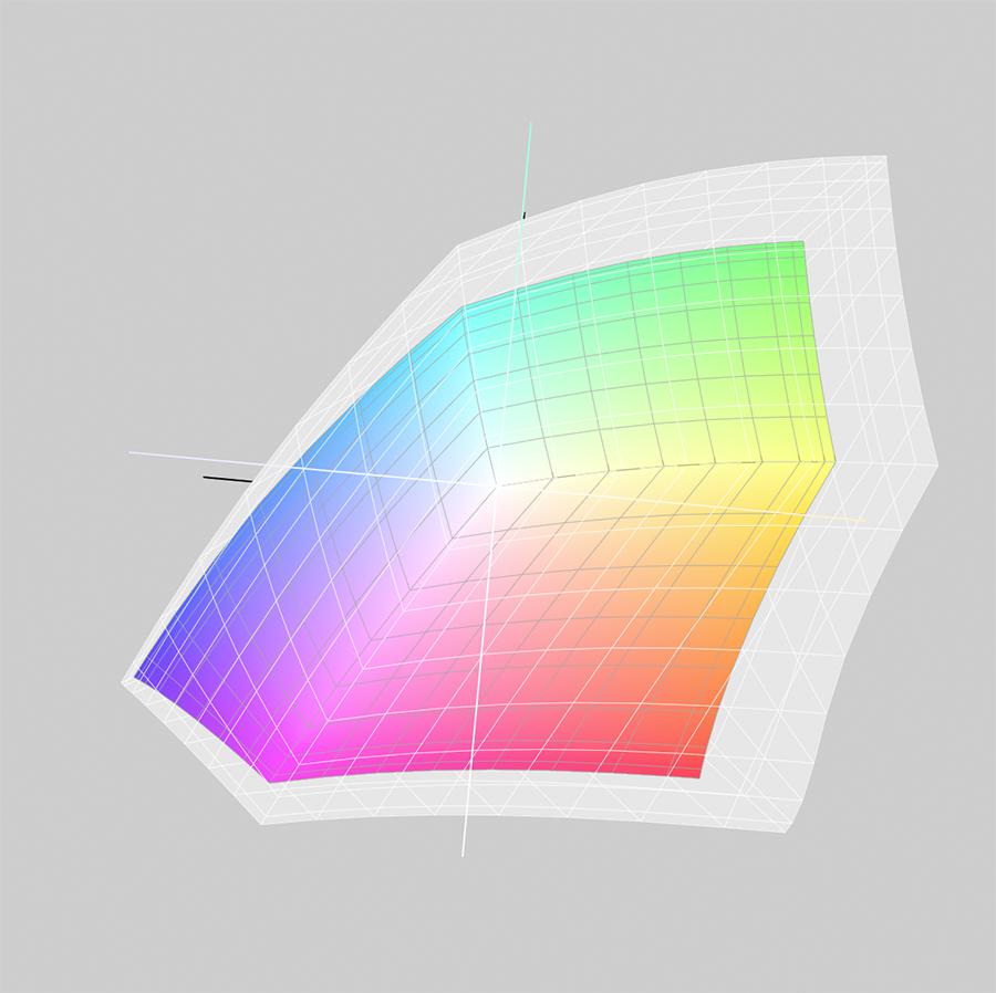
Figure 14
sRGB in color compared to Apple P3 in white. The P3 colorspace extends sRGB quite evenly on the right side.
Grab Bag
The 27-inch 5K iMac has a model identifier of iMac17,1. While the 21.5-inch 4K iMac's model identifier is iMac16,2.
These iMacs are running specific new-product builds of Mac OS 10.11.0 which will presumably be rolled into 10.11.1. The standard version of 10.11.0 is build 15A284. The 27-inch 5K iMac is running build 15A4310 and the 21.5-inch 4K iMac is running build 15A2301.
I have confirmed that 30-Bit color is working on a 27-inch iMac. A 16-Bit greyscale ramp was used to test. Applications which support this capability are quite sparse. At the time of my testing Preview worked and Pixelmator did not. It is likely that applications need to opt‑in to use this feature. The standard 24-Bit pipeline is indicated with Pixel Depth: 32-Bit Color (ARGB8888). New 30-Bit color pipelines will show Pixel Depth: 30-Bit Color (ARGB2101010) or Pixel Depth: CGSThirtyBitColor. I have also been able to get 30-Bit color working on my Dell U2713H via DisplayPort. Support seemed sparse and intermittent in earlier versions, but as of 10.11.3 everything works well in my experience.
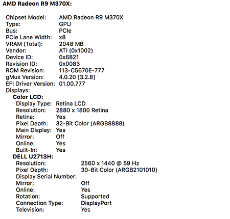
Figure 15
Output of System Information showing the displays attached to my 15" MacBook Pro. Note that the Dell U2713H is in 30-Bit color mode.
iFixit reports the 21.5-inch 4K iMac uses LG's LM215UH1 panel in this teardown. There does not seem to be much information on the panel available as of this writing.
Apple's P3 gamut target appears to be a little bit different than the one you get if you generate a profile using DCI's specified coordinates. AnandTech revealed that Apple's P3 profile uses 2.2 gamma, whereas DCI's spec calls for a gamma of 2.6. I've used Apple's target for all of my comparisons in this post. Both Apple's P3 profile and the generated one are available for download below.
The 27-inch 5K iMac with Intel i5-6500 and AMD Radeon R9 M390 has an Unigine Heaven Benchmark 4.0 score of 2008 using the Basic preset. Benchmark output.
Subjectively these are both lovely displays. Contrast is high, accuracy out of the box seems quite decent, and the ones I saw look to be hitting their P3 gamut targets. They get bright but seem to retain contrast as you dim them — an important factor.
Downloads
Here are some profiles I referenced during my research.
- The common Display P3 profile on all three of the wide gamut iMacs I tested (ZIP, 498 Bytes): Download
- 27-inch iMac 5K factory profile (ZIP, 3 KB): Download
- 21.5-inch iMac 4K factory profile (ZIP, 3 KB): Download
- DCI-P3 profile generated in Photoshop from DCI-specified x,y coordinates (ZIP, 757 Bytes): Download
These are dumps of ioreg -lw0 which may be useful for taking a deeper look.
- ioreg dump from 27-inch 5K iMac (ZIP: 184 KB): Download
- ioreg dump from 21.5-inch 4K iMac (ZIP, 111 KB): Download
Here are ACPI tables extracted using a tool called MaciASL for a Linux driver developer.
- ACPI dump from 27-inch 5K iMac (ZIP: 63 KB): Download